
Have you ever left a website feeling frustrated because you couldn’t find what you were looking for? We’ve all been there—desperately clicking through endless menus, battling with unresponsive layouts, and traversing through endless content that doesn’t seem to tell you what you need.
In a world where attention spans are getting shorter every day, and competition for user engagement is fierce, perfecting your website design has slowly become one of the most important factors of running a home service business today.
Together, let’s learn what responsive website design is, and the best practices you can implement to help get more customer conversions.
What is Responsive Website Design?
Responsive web design (RWD) is an approach that emphasizes the adaptability of design and development of a website to suit the user’s behaviour and surroundings, taking into account factors such as screen size, platform, and orientation
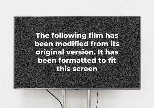
This approach incorporates a combination of flexible grids, layouts, images, and CSS media queries to create a dynamic web experience. When a user switches devices, such as moving from a laptop to a cell phone, the website should seamlessly adjust to fit the new screen resolution, image dimensions and scripting abilities—similar to when you see a TV message that says “The following film has been modified from its original version. It has been formatted to fit this screen.”
Additionally, the website will consider the user’s device settings, such as the presence of a VPN, and ensure that it doesn’t hinder the user’s access to the content. In essence, a RWD employs technology that automatically adapts to the user’s preferences, eliminating the need for separate design and development phases for each new device that emerges on the market
Components of Responsive Web Design
Responsive web design features three important elements. These elements
- Fluid Grids: Percentage based design that adapts to the screen size accordingly.
- Flexible Images: Image size in relative units to prevent them from displaying outside their containing elements.
- Media Queries: A way to apply CSS rules to the page based on the size of the displaying browser
Why Does Responsive Website Design Matter for My Home Service Business?
These days, everyone and their grandma’s are using their mobile devices to browse the Internet. In fact, according to statista, mobile devices accounted for 55% of all website traffic—and it’s not stopping any time soon.

This is just further evidence that in order for your home service business to thrive, you need to have a website that is accessible on any device, anywhere—and the most effective approach to achieve this is through responsive web design.
If your website is not responsive, you are missing out on valuable mobile user traffic. If they cannot view your website properly on their phones or tablets, they will quickly “x” out and look somewhere else
Benefits of Responsive Web Design for Home Service Businesses
A responsive website enhances the user experience, resulting in increased customer engagement and conversions.
But responsive websites aren’t just advantageous for home service businesses, it’s great for consumers. Now, users can effortlessly access any information they want, any preferred device—whether it’s a laptop, tablet or smartphone—with the simple touch or click of a finger.
Other benefits include:
- Consistent Visual Experience: RWD ensures that users receive an instant and visually appealing experience across various devices.
- Enhanced User Experience (UX): Responsive websites adapt to different screen sizes, providing a user-friendly interface and intuitive navigation, ultimately improving the overall user experience.
- No Need for Redirects: With a responsive website, there’s no need for redirection to a separate mobile version, simplifying the browsing experience for users and design time for you.
- Lower Bounce Rates: A RWD reduces bounce rates, as visitors are more likely to engage with a website that is optimized for their devices, resulting in increased user retention.
- Reduced Maintenance Needs: Managing a single responsive website is more convenient and requires less maintenance compared to maintaining multiple versions for different devices.
- Faster Web Page Loading Speeds: Responsive websites are optimized for quick loading, minimizing the waiting time for users and enhancing their browsing experience.
- Cost-Efficient: Creating and maintaining separate versions of a website for different devices can be costly. A responsive website eliminates the need for additional fees, saving both time and resources.
- Easy Analytics Reporting: With RWD, tracking and analyzing website performance and user behaviour is simplified since there is only one website to monitor, leading to more accurate and comprehensive analytics reporting.
Responsive Design Best Practices for Small Businesses
Mobile-First Approach
Starting your website with a desktop design may seem like the right approach, but taking a mobile-first approach is often the better route. Why? Mobile devices pose more challenges that designers will need to tackle anyway. By prioritizing mobile design first, you reduce the likelihood of facing significant hurdles when developing other versions of your website. Moreover, mobile websites emphasize simplicity and clarity, which enables you to prioritize user-friendly design right from the get-go.
Then, after identifying the core features, you can seamlessly transition to a larger version. By avoiding clutter in the early stages of design, you can expand on the desktop version as needed while maintaining confidence in the quality of your mobile website.
Easy-on-the-Eyes Fonts
Many web designers prioritize the visual appeal and compatibility of a font with the overall style of a website. However, an important factor to consider is whether a font can effectively adapt across different versions of the website. While thin lettering may be visually pleasing on a desktop, it becomes unreadable when scaled down for mobile users. That’s why when creating a website, it’s important to test each font on various devices before making a decision.
For optimal readability, the default font size of 16 is widely accepted by most browsers and tends to work well across different website versions. When formatting headings, we recommend increasing the font size to at least 1-½x larger than the body text. This ensures clear differentiation and improves the hierarchy of the content.
Scalable Navigation
Scalable navigation plays an important role in maintaining usability by dynamically adjusting the position of menus and navigation bars. This adaptation prevents them from being hidden or difficult to click when the display size is reduced.
When optimizing navigation for mobile devices, it’s sometimes necessary to simplify your features. In these cases, prioritize displaying the options that are most frequently accessed by your users. By identifying the key functionalities and prominently presenting them, you enhance the usability of your mobile navigation and ensure that essential features are easily accessible.
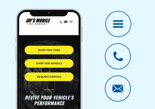
Use Icons
Instead of text everywhere, think of places you could use icons instead.
Icons have the advantage of removing unnecessary distractions caused by excessive text and aid users in navigating your website seamlessly across all versions—especially on mobile devices where icons contribute to clean and visually appealing pages.
Additionally, you can use icons to enhance your brand image. You can use them to incorporate elements of your logo or services, allowing for a cohesive and efficient design that impresses users with their creativity. By utilizing icons effectively, you streamline the user experience, maintain visual aesthetics, and reinforce your brand identity, making it easier for users to engage with your website.
Reduce Mobile Device Friction
Friction in design refers to elements that impede or slow down user activity, making it difficult for them to accomplish their intended actions. While desktop users have more flexibility in loading new pages and engaging with various website features, mobile users prefer a streamlined design with minimal loading demands
Optimize Images
Images play a pivotal role in website design, often serving as a prominent feature. For instance, many homepages utilize a single, high-resolution photograph as their captivating background. To maintain the visual impact and alignment of your intended website design, it is important to optimize these images. Consider cropping your images to match the display dimensions of each device version.
Additionally, you can assign different image resolutions for various device types, allowing users with smaller displays to load appropriately sized images when accessing your site. This approach ensures that your images remain visually appealing and well-suited for different devices.
Use Mobile Ergonomics
Ergonomics isn’t just about having a comfy chair. In the case of a website, it’s about making your website comfier for mobile users to scroll and click through.
Mobile users heavily rely on thumb navigation when interacting with your website. That’s why you need to prioritize ease of use for each user input in your mobile versions.

Here are a few ergonomic-focused design considerations to keep in mind:
- Enlarge buttons: increasing the size of your buttons will make them easier to tap with a thumb. This helps prevent accidental taps on neighbouring elements and improves overall usability.
- Expand text fields: make blank text fields more spacious to enhance their selection. This adjustment minimizes the risk of users struggling to accurately tap on the intended text field.
- Place key features within thumb reach: place elements, such as navigation menus or primary actions, where users can conveniently reach them with their thumbs. This ensures that key functionality remains easily accessible and reduces the ends for excessive hand movement.
By implementing these design choices, you can enhance the mobile user experience, making it more ergonomic and user-friendly for thumb-based navigation.
Account for Landscape View
Consider both portrait and landscape views when designing for smaller devices. Landscape is the default orientation for some tablets. In landscape, scrolling is harder due to limited vertical space. Use left-right sliders instead of relying only on scrolling to improve user experience in landscape orientation.
Fluid Layouts and Responsive Breakpoints
Fluid layouts dynamically adapt layout elements to fit window dimensions, ensuring content remains visible during browser resizing. Responsive breakpoints modify the layout as users adjust window size, without directly resizing elements. Experimenting with settings is crucial to balance these techniques. Fluid layouts enable window customization, but without breakpoints, content may become too small. Use breakpoints sparingly to preserve the user experience across various window sizes.
Test Each Version on Several Devices
To fully understand the user experience your website offers, it’s important to test it on a wide range of devices. Engage users to evaluate each version of your site and request feedback on any instances of confusion or frustration during navigation. Besides evaluating usability, consider surveying users to engage how their website experience influences their perception of your brand and their inclination to make a purchase.
Boost Your Customer Engagement With Responsive Web Design
Transform your home service business with responsive website design and discover the best practices that will elevate your website to new heights.
From modern aesthetics and SEO optimization to captivating content, the web design team will show you how to captivate customers and generate interest in your business and services. Contact Harvard Excelerate today to start building a website that truly shines!

